Starting Out: 9 Abstract Painters 1958–1971
When I first walked into Starting Out: 9 Abstract Painters 1958-1971, I didn’t immediately remember that the pristine space on Fifth Avenue was the site of a raucous opening I had attended decades ago for a 40th Anniversary Exhibition— where Larry Rivers was present. Without the hecticness of a large crowd, there was a serenity that enabled me to see and be enveloped by the large-scale paintings (in addition to framed works on paper) in solitude, and with the advantage that an empty gallery allows.
The premise of the show, as outlined in the press release, is to highlight a different time not currently prominent in the art public’s mind—“the late 1950s into the 1960s.” It was the period when the gallery championed the work of a new group of abstract painters, referenced as “the second-generation New York School.”
Most of the exhibited artists continued to explore abstraction for the duration of their careers in one form or another. Others, such as Jane Freilicher (b. 1924), evolved to a place where she expressed her vision through representational images. The gallery states that for Freilicher abstraction was “a resting point.” Ironically, it is her oil on canvas that is the first painting that greets the visitor upon arrival.

Jane Freilicher
Untitled Abstraction
c. 1960
Oil on Canvas
49” x 50”
Untitled Abstraction can be read as a precursor to her future landscape paintings. Areas of blue at the top of the canvas and bottom sections of scumbled green—that evidence the drip marks of thinned paint—act as points of enclosure for a sandy colored swath which is punctuated by accents of red. Freilicher studied with Hans Hofmann, absorbing his lessons about non-objective painting. By 1963, in her watercolor on paper, Freilicher titles the piece Abstract Landscape. She is on the road to the imagery that would be clearly defined two years later.
Edward Avedisian (b. 1936), in his painting as well as his gouache on paper, makes use of strategically placed concentric circles placed in a larger field of opaque color. Their pictographic quality, combined with the ochre field it is placed upon, call to mind symbolic markings on the African masks of Burkina Faso.
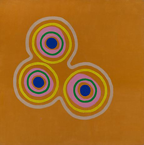
Edward Avedisian
Normal Love #1
1963
Liquitex on Canvas
67 1/4” x 67 1/2”
Strategically placed on a wall by itself is Many Parts by Friedel Dzubas (b. 1915). Large floating forms resembling landmasses exist as individual islands of color. Although that are separate, they appear interactive. The shapes are static, yet there is a sense of movement. There are what appear to be shadows behind the colors of gunmetal grey, ultramarine blue, yellow, and sherbet green. Rather, they are stains from the medium mixed with the paint—which is flat and without texture. Dzubas emigrated from Nazi Germany in 1939. Thirteen years later, he would share a studio with Helen Frankenthaler (b. 1928).

Friedel Dzubas
Many Parts
1962
Oil on Canvas
84” x 69”
There are numerous connections between the different artists in the show—such as friendships or student-teacher relationships. Part of the history of the Tibor de Nagy gallery is embedded in the camaraderie that grew within a community of artists, poets, and writers.
Frankenthaler’s Two Live as One on a Crocodile Isle is hung opposite the work of Dzubas. She studied at Bennington with Paul Feeley (b. 1910). Frankenthaler was included in two shows at Tibor de Nagy in 1951. In the spring, she was featured in The New Generation exhibit. At the end of that year, she had a solo show. Here, she uses oil washes to achieve both a spontaneous and a lyrical character. Combining color, fluidity, and spontaneous markings, there is the suggestion that the movement within the canvas can only be temporarily contained.

Helen Frankenthaler
Two Live as One on a Crocodile Isle
1959
Oil on Unsized, Unprimed Canvas
82” x 55”
Adjacent to the Frankenthaler is a narrow painting by Kenneth Noland (b. 1924). His output, frequently divided into categories reflecting the geometric impetuses of his work—circles, chevrons, diamonds, stripes, and plaids, were examined and reexamined. Space of Red falls into the “plaid” period. Muted tones of reds and purples stain the surface while combining tonalities with vertical and horizontal lines.
Represented by both works on paper and a painting, Feely’s canvas challenges the observer to gravitate between perceiving the work through the prism of either positive or negative space. His blue expanse can easily read as a body of water between two earthly regions. Then again, while focusing on the yellow vastness, his blue transmits the symbolism of an hourglass.

Paul Feeley
Trajan
1960
Oil-Based Enamel on Canvas
69” x 46”
In his watercolor, executed two years earlier, Feeley investigates interlocking shapes that mimic each other. Here he uses three colors with an intermediary band establishing a neutral no-man’s-land, thereby alleviating the conundrum of an either/or resolution. The interlocking shapes suggest both male and female manifestations, simultaneously thrusting and receiving.

Paul Feeley
Untitled
1958-59
Watercolor on Paper
16” x 11”
Also engaged in the use of positive and negative space is Kendall Shaw (b. 1924), who had three one-person shows at the gallery in the mid-Sixties. Shaw uses form and color as a meditation on the energy of space, placement, and connection. Of the six panels, all colors claim a wide band and a narrow band. It is how they interface with the wall and to each other that is crucial. Like Feely, Shaw challenges participants to the witnessing process to resolve their own determination as to where the borders and frontiers lie. For Shaw, color is feeling, and here every unit operates both individually and as part of a whole.

Kendall Shaw
Escatawpa Sunrise
1968
Acrylic on Canvas (6 panels)
96” x 168”
The large, seemingly monochromatic work of Ralph Humphrey (b. 1932) invites a prolonged examination of his tactile and velvety black surface. The conscious application of paint is evident in his use of texture as hints of blue and evidence of brick red reveal themselves as part of the underpainting. There is a feeling of planetary “other worldliness,” as if one is viewing part of something that fell to earth. The canvas yields a hint of Humphrey’s work to come, which would explore subtle modulations of color on wood—as well as his witty and spirited “window paintings.”

Ralph Humphrey
Alma Court #1
1958
Oil on Canvas
84” x 66”
While Humphrey’s image struck me as lunar, the Darbary Bannard (b. 1943) gouache and pencil on paper (1962) and his alkyd on canvas resonated as solar. Executed during a period of minimalism, Bannard’s pencil drawn circle, surrounded by a halo of yellow paint, almost looks as if it were achieved through the use of a protractor. There is a slight element of shading that gives the circle a three-dimensionality, yielding the potential of a sphere. Perhaps Bannard was working out ideas he would explore the following year, when he placed a half-circle of saturated yellow at the bottom of his canvas.

Darby Bannard
Yellow Rose #1
1963
Alkyd on Canvas
62” x 62”
Many of these artists veered in totally different directions as time passed and they continued to challenge themselves with questions about how they were painting and what they were trying to express. Bannard, in a recent article in the Miami press in conjunction with a 2012 exhibition, spoke about finding himself “at loggerheads with the art world’s tastemakers.” He stated, “I don’t change for any reason except that I want to keep myself interested.”
This exhibit gives gallery goers the opportunity to see how that path started for him and his contemporaries.
Photos: Courtesy of Tibor de Nagy Gallery
Tibor de Nagy Gallery
June 5, 2014 – August 1, 2014
724 Fifth Avenue
New York City